Nehish IT Consulting Services Private Limited is a trusted financial technology partner specializing in delivering innovative and tailored solutions to banks, neobanks, and financial institutions globally. To strengthen its position in the competitive fintech landscape, Nehish embarked on a rebranding journey to align its visual identity with its modern, client-centric, and forward-thinking values.
Why did we decide to re-brand?
Nehish embarked on a rebranding journey to align its visual identity with its modern, client-centric, and forward-thinking values.
Outdated Visual Identity: The old logo lacked modern aesthetics and failed to convey the technological innovation and precision associated with Nehish’s offerings.
Global Outreach: The brand needed a versatile and inclusive identity to resonate with an international audience.
Consistency Issues: The absence of unified branding guidelines led to inconsistencies across communication channels.
We made initial efforts to patch up our existing branding. The more we tackled it, the more we understood the founding weaknesses that were holding us back. We needed a clear set of values and a new identity to better express the significance of our offering.
Brand storyboarding
We began our rebranding journey by immersing ourselves in what Nehish has already accomplished and envisioning where we are heading. Collaborating across our teams in Dubai and Bengaluru, we engaged with employees, stakeholders, and clients to gather insights into how they perceived and described our values.
In close collaboration with user experience analysts and management teams, we initiated the process by defining a brand storyboard. We explored how our financial technology solutions empower institutions to advance and transform their services. This exploration laid the foundation for identifying and refining our core values. These values would ultimately shape the essence of our brand’s personality and act as guiding principles for every branding decision we make.
Initially, we created an extensive list of values, reflecting inputs from across the organization. Through discussions and careful deliberation, we distilled this list into three core values that encapsulate Nehish’s mission and vision.
The Old Logo: Tradition Meets Simplicity
The original Nehish logo represents the brand’s early focus on clarity and professionalism. With a clean black font and a circular icon enclosing the letter “N,” the old logo conveys trust, simplicity, and straightforwardness. The circular element creates a sense of unity and completeness, aligning with the company’s foundational goals of offering cohesive and integrated solutions. However, its minimalistic design lacks dynamic elements, which limits its ability to resonate with a rapidly evolving, tech-forward audience.
Analysis of the Old Logo
The old logo for Nehish, while functional, lacked the visual appeal and depth needed for a brand operating in the fintech sector. Its primary limitations included:
Lack of Innovation: The design was simple to the point of being generic, failing to communicate the innovative spirit of Nehish’s services.
Limited Scalability: The design elements did not translate well across various platforms and touchpoints, making it less adaptable for digital and physical media.
Inadequate Color Scheme: The muted and limited color palette did not evoke a sense of modernity or trust, which are critical in the fintech industry.
Missing Symbolism: The logo lacked strong visual symbolism to represent the brand’s mission, vision, and core values, such as technological advancement and precision.
Evolution from the Old to the New
As Nehish grew into a prominent player in the financial technology sector, its outdated logo began to pose challenges in accurately reflecting the brand’s identity. The logo failed to resonate with the target audience, which included global banks, neobanks, and financial institutions. Recognizing the need to modernize and unify its branding, Nehish set out on a rebranding journey.
Setting the Stage: A Need for Transformation
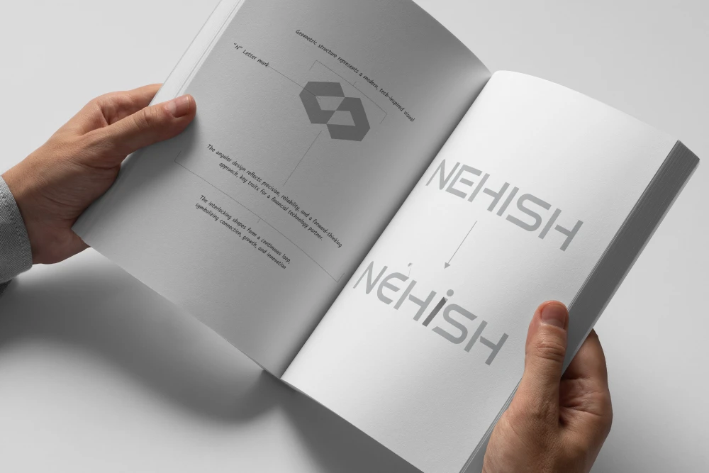
The design team worked meticulously to create a logo that embodied Nehish’s essence: Symbolic Representation: The new logo features an abstract geometric “N” symbol that encapsulates modernity, precision, and technological innovation.
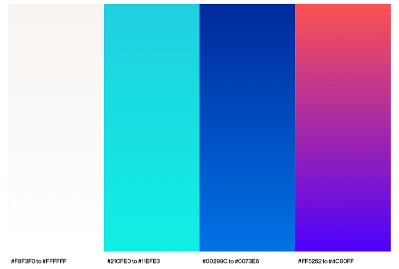
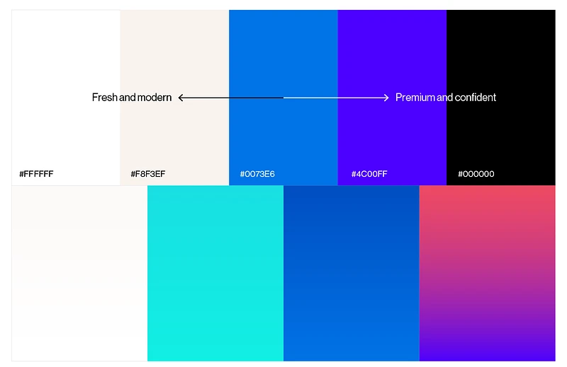
Dynamic Color Palette: Vibrant blues were chosen to signify trust, professionalism, and innovation, while accents of aqua and white added a fresh, modern touch.
Enhanced Typography: A clean and bold typeface complemented the geometric design, ensuring readability and a professional appearance across mediums.
Customizing the right font: The typography underwent a transformation to reflect the brand’s modern and innovative character. A bold, clean typeface was further customized by adding unique elements, such as the highlighted “i” with a dot, symbolizing individuality, creativity, and a client-focused approach. This customization not only enhances brand recognition but also adds a distinctive and memorable element to the logo.